
AAA Mobile App Reimagined
How I led the redesign of AAA's mobile app: making the case to break through technical debt, restructuring the experience around member needs to lift engagement 120%, improve task success by 25%, and building a scalable design system that accelerated engineering velocity.
Reshaping the AAA mobile experience meant breaking through years of technical debt and rigid business mandates. As the Senior UX Designer leading this initiative, I led the pivot from a disjointed legacy framework to a cohesive, modern mobile ecosystem. Beyond interface modernization, we realigned the experience around member needs, driving a 120% increase in engagement, a 25% improvement in key task success rates, and significantly accelerating engineering velocity through a scalable design system.
Role
Lead Designer
Scope
Native iOS & Android App
Company
ClubLabs (AAA)
Year
2021
The Challenge & Outcome
The AAA mobile app suffered from years of technical debt and disjointed offshore development. We were constrained by a rigid technical framework that blocked meaningful improvements, while outdated business mandates prioritized aggressive upselling over actual user needs.
My goal was to reverse this dynamic and shift the focus back to the user. I led the initiative to modernize the interface and transform the disjointed user experience into a cohesive, scalable platform.
By transitioning from a legacy 'drawer' navigation to a modern, user-centric tab architecture, we didn't just elevate the aesthetic. We drove a 120% increase in engagement, improved key task success rates by 25%, and established a modular design system that accelerated engineering velocity for future releases.

Strategy & Architecture
Balancing Scale with Discoverability
The core challenge was architecting a navigation system for a multi-vertical product. AAA’s business lines have distinct user behaviors: Insurance is transactional (paying bills), while Travel & Discounts are browsing-focused (discovery).
The legacy side drawer (Hamburger menu) offered significant scalability for these lines but suffered from near-zero discoverability. Users simply didn't know what features existed.
The Hypothesis
We hypothesized that exposing core business lines directly via a Bottom Tab Bar, rather than burying them in a drawer, would reduce cognitive load and drive engagement. However, shifting to a rigid 5-tab structure was a significant constraint. We needed to prove that users could actually locate and access these diverse verticals more effectively in this new layout before committing to the pivot.
Validation (A/B Testing)
We launched unmoderated remote testing with 40 participants to compare the legacy side drawer against a new bottom tab architecture.
The bottom tab bar model significantly outperformed the side drawer, yielding a 25% higher task success rate and faster time on task.
The Solution: A Hybrid Navigation Model
We operationalized these findings by moving to a hybrid framework:
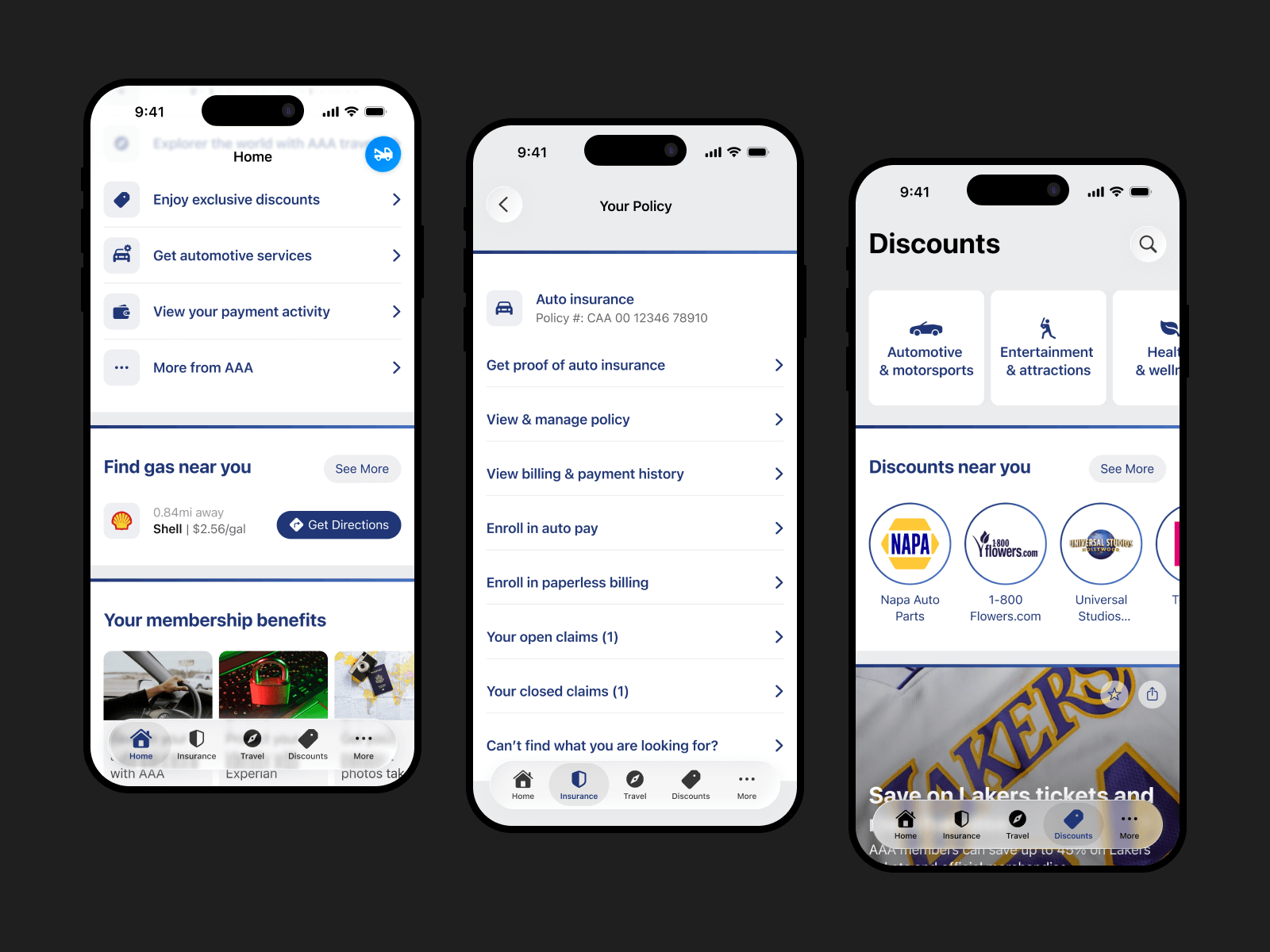
Global Navigation Layer: A persistent bottom tab bar for instant switching between core lines of business, such as Insurance and Membership.
Transactional System: A utility-focused structure for the Insurance page. It prioritizes clear task lists and efficiency for high-stakes actions like bill payments and policy management.
Browsing System: A discovery-oriented layout for Discounts & Travel. It utilizes rich imagery, feeds, and prominent search tools to encourage exploration and longer sessions.
The hybrid navigation model: global, transactional, and browsing.
The Initial Concept
Iteration 1: The Visual Refresh
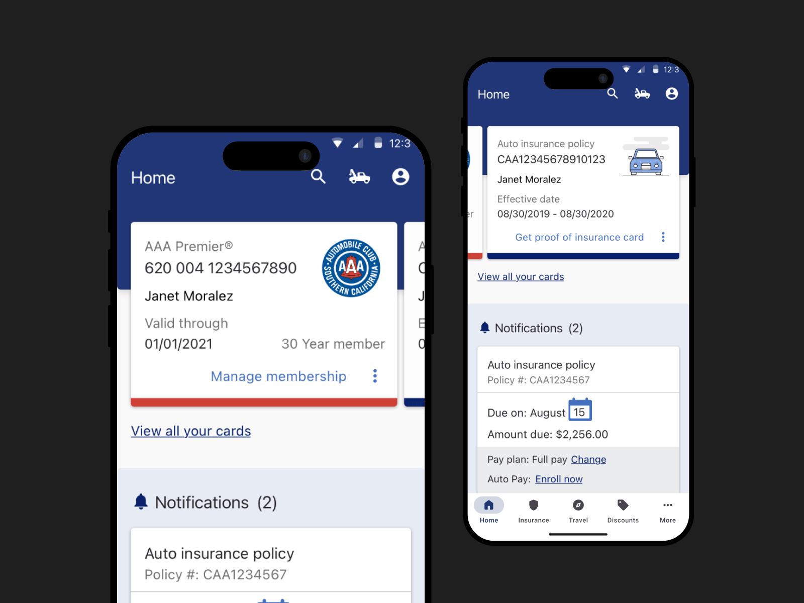
Our initial concept prioritized visual simplification. We decluttered the home screen and elevated the Membership Card, operating on the hypothesis that minimizing visual noise would naturally improve discoverability.
However, usability testing exposed a critical disconnect between the visual design and user intent. While the interface succeeded aesthetically, the data revealed significant usability failures across three key areas:
Critical Discoverability Gaps
Ambiguous Iconography: Users struggled to locate "Roadside Assistance" during urgency-focused tasks. While some guessed the tow truck icon was the trigger, they explicitly stated the iconography was unclear.
Mental Model Mismatch: Users intuitively searched for "cheap gas" under the Travel tab. However, strict business requirements mandated that the feature remain in a separate vertical, causing a conflict between the necessary structure and user expectations.
The "Membership Card" Mental Model Failed
Confusing Affordances: Users perceived the Membership and Payment cards as entry points to "manage everything," including insurance policies. This led to confusion as users tapped static elements, expecting to access management tools rather than just viewing the card.
Hidden Insurance Proof: The interaction design for the "Proof of Insurance" card (a swipe gesture on the membership card) had near-zero discoverability. Most users failed to find it entirely.
Navigation & Sentiment
Inconsistent Browsing: Navigation behavior was erratic. Some users scrolled the Home screen aimlessly to find entry points, while others bypassed the content entirely to use the bottom tabs.
Low User Confidence: The overarching sentiment was negative. Participants explicitly mentioned they did not feel confident that their choices would lead to the correct task completion.
The first design iteration tested with users.
The Strategic Pivot
Iteration 2: Optimizing for Task Success
Based on the findings from the first iteration, we pivoted the design strategy. While we maintained the goal of a cleaner UI, we shifted the focus from visual reduction to quick access. We restructured the interface to align with observed user behaviors, specifically targeting the breakdown between emergency needs and browsing.
Key Design Changes
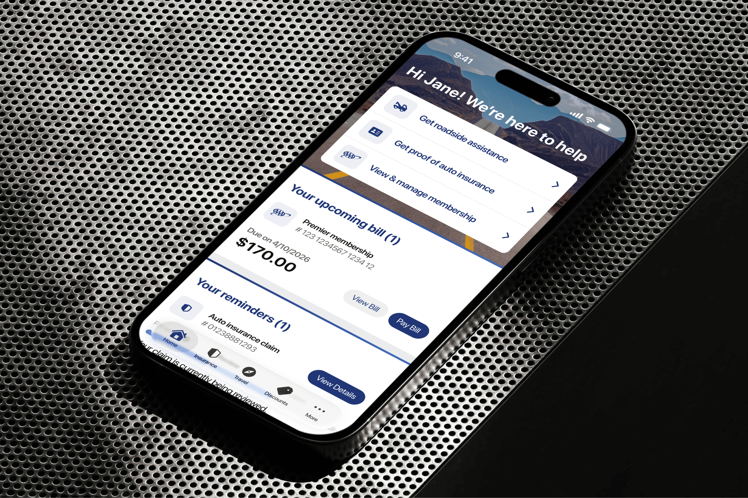
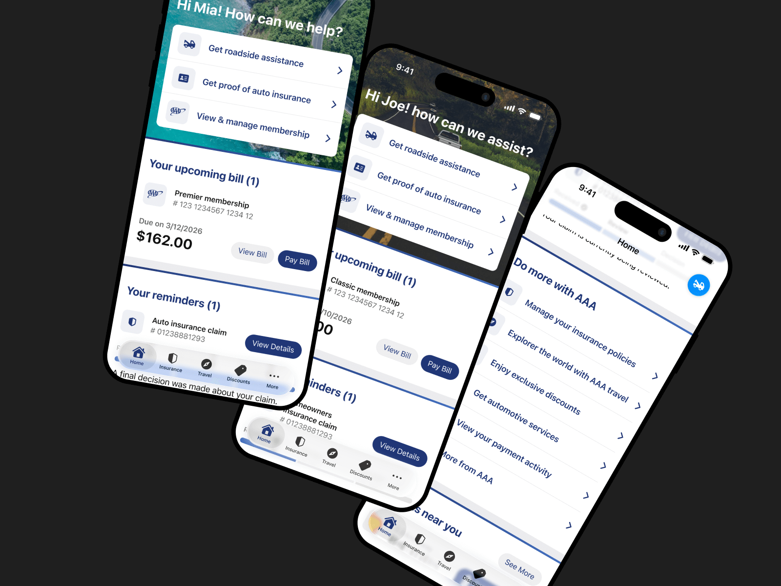
The "Quick Actions" Component: We introduced a dedicated section at the top of the home screen. This provided immediate, one-tap access to high-priority tasks (such as Roadside Assistance), bypassing the need to navigate deep menus.
Mental Model Mismatch: We completely removed the interactive "Membership Card" concept that caused confusion in Iteration 1. Instead, we moved these entry points into the "Quick Actions" and distinct lines of business areas to match how users naturally scanned the page.
Auxiliary Navigation: We added links at the bottom of the home screen to catch users who habitually scroll to find information.
Validation: Measuring Impact
To validate the new direction, we launched a second round of unmoderated user testing. We specifically targeted the key tasks we knew users perform most frequently, ensuring the data reflected real-world value. By using the exact same tasks and audience profile as the first round, we were able to directly quantify the success of our design changes.
The second iteration significantly outperformed the first, with critical improvements in high-priority flows.
"Quick Actions" Solved the Urgency Gap: The new component transformed the emergency experience.
Time on Task: Users found Roadside Assistance 69% faster (dropping from 1:39 to just 0:30).
Success Rate: Task completion jumped from a risky 66% to a perfect 100%.
The Mental Model Mismatch Was Resolved: By removing the ambiguous card interaction and moving to the "Quick Actions" paradigm, we eliminated the previous confusion around the card functionality and the information it was holding.
Time on Task: Users found how to manage their membership 54% faster (dropping from 1:39 to 0:45).
Success Rate: Task completion rose from 73% to 100% (up from 73%).
Proof of Insurance: The new entry point allowed users to find their proof of insurance in just 17 seconds (down from 31 seconds) with a 100% success rate (up from 80%).
1st vs. 2nd iteration: time-on-task and success rate.
The Home Screen: a Contextual Dashboard
Beyond the urgency of "Quick Actions", we designed the wider Home Screen to balance functional utility with a personalized touch. We drilled down into specific user behaviors, from how they pay bills to how they scroll, to ensure every component on the screen served a distinct purpose.
Personalization & Tone
To humanize the utility experience, we utilized the header space to introduce dynamic personalization. We moved away from generic stock imagery to localized photos based on the user’s specific AAA club region, paired with time-aware greetings. This shift helps transition the app from a cold utility to a helpful companion.
Refining Visual Hierarchy
Payments and Reminders
To further reduce cognitive load, we focused on the specific design of the "task" cards.
The Payment Card: We recognized that financial tasks require immediate clarity. We redesigned the bill pay card to be distinct from other notifications. Crucially, we added an “empty state”, a clear visual indicator when a user’s account is in good standing, to provide immediate peace of mind.
The Reminders Section: We decoupled non-financial alerts (like policy updates) into a secondary "Reminders" section. This prevents "alert fatigue" and ensures critical financial notifications aren't lost in the noise.
Supporting Two Navigation Behaviors
While the new Tab Bar addressed the primary user navigation behavior, observations showed a segment of users still preferred scrolling the screen to find features. To accommodate this behavior without cluttering the UI, we introduced Auxiliary Links at the bottom of the feed. These links provide "backdoor" access to high-value features that were often hidden deep in the 'More' menu.
Turning Noise into Value
Previously, the Member Benefit cards were not confined to a single area; instead, they dominated the vertical space of the home screen. Feedback indicated that users dismissed these sprawling cards as "meaningless ads." To address this, we consolidated the offers into a streamlined, swipeable carousel and rigorously trimmed the copy, transforming what was once intrusive noise into a curated, discoverable perk.
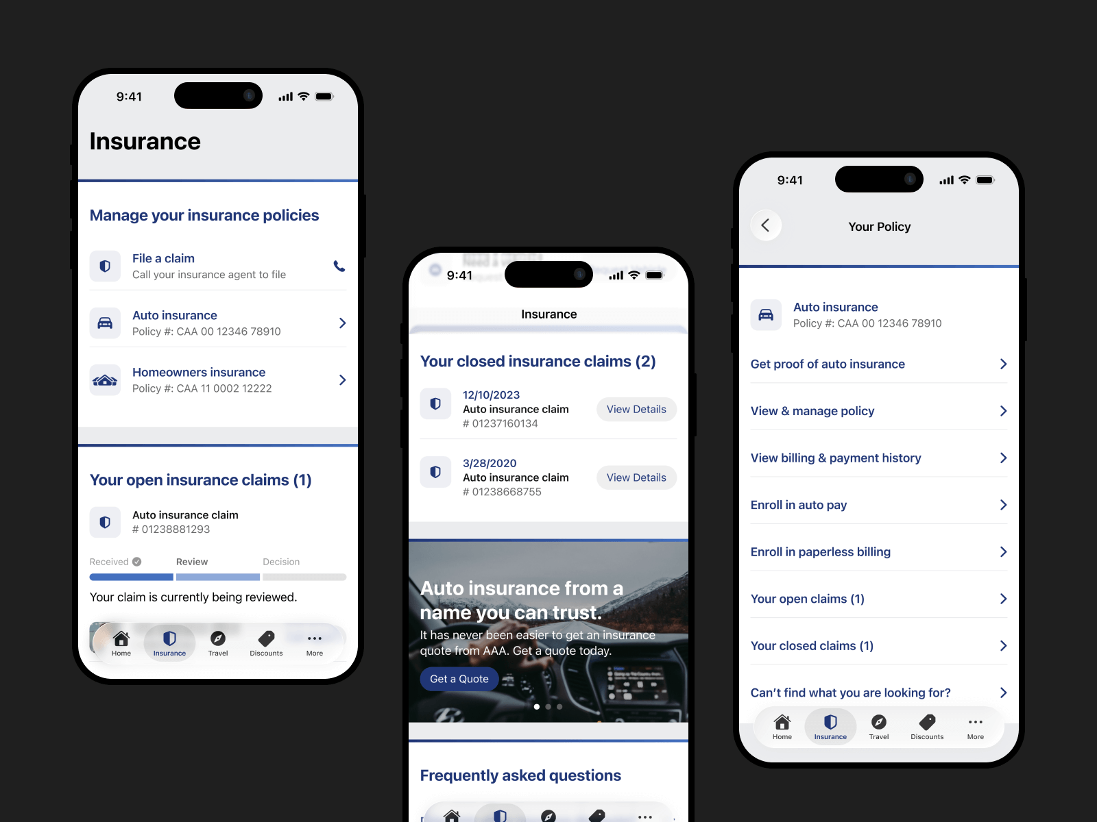
Future-Proofing Insurance Management
A critical gap in the legacy app was the inability to manage insurance policies. Users were restricted to a read-only view. Collaborating closely with the Insurance Product team, we set out to build a self-service suite. While the Insurance screen design was straightforward, the navigation structure for the specific task menu sparked a debate.
The Trade-Off: Context vs. Scale
We tested two viable menu patterns: a bottom sheet task menu and a dedicated policy task screen. The results were inconclusive, with both performing similarly. To make an informed decision, we weighed two critical factors:
Contextual Continuity
The bottom sheet was seamless. It allowed users to interact with the task menu without leaving the context of the insurance screen, preserving their orientation.
The policy task screen, on the other hand, required users to leave the insurance screen.
Scalability
The bottom sheet was limited to a maximum of 9-10 items. The policy task screen, conversely, could theoretically accommodate an infinite number of items.
Since our goal was to develop a scalable framework, and the roadmap indicated the number of tasks would likely grow, we chose scalability over immediate context. We implemented the dedicated policy task screen, ensuring the design wouldn't break as business requirements expanded.
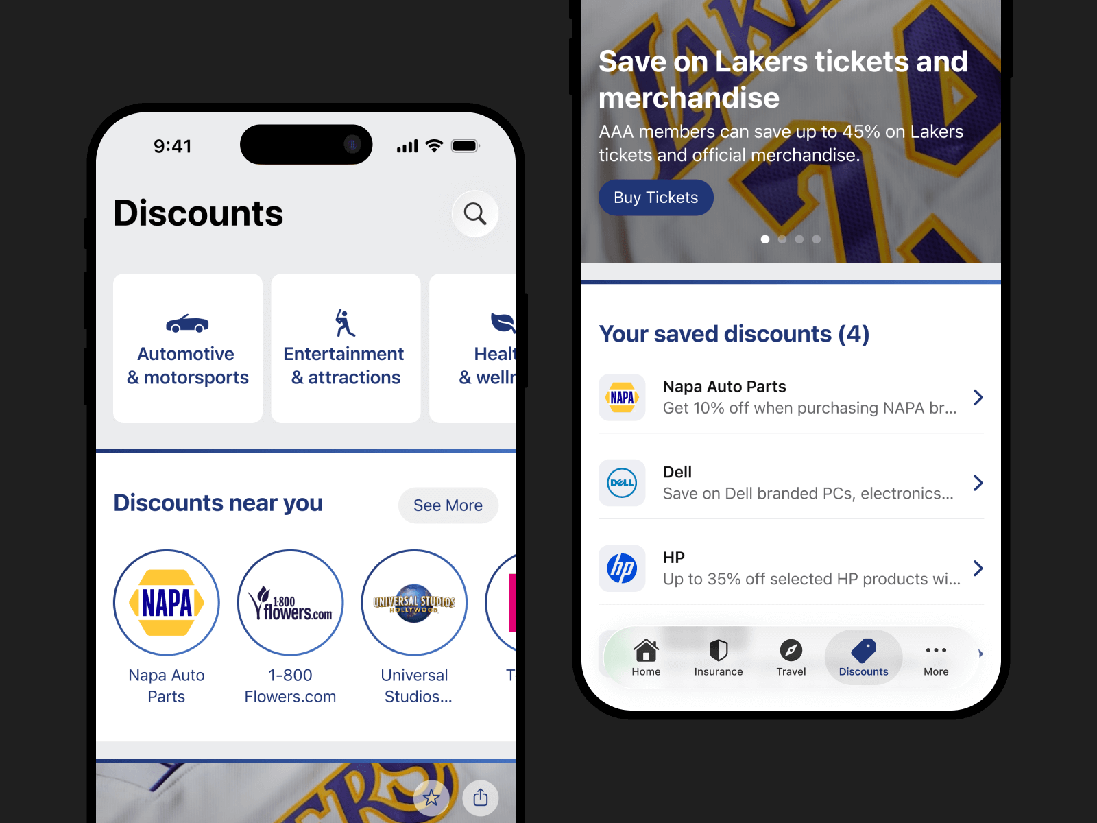
A Unified Framework for Discovery
Unlike the transactional nature of Insurance, the Travel and Discounts verticals are driven by exploration. Users aren't there to "complete a task" quickly; they are there to browse.
To preserve consistency across the app, we implemented a unified navigation framework for both business lines. This ensures that once a user learns how to browse for a hotel, they can intuitively find a discount.
Designing for Exploration
We shifted the UI pattern from "lists" to "cards," utilizing full-bleed imagery to drive engagement. To help users navigate the density of offers, we introduced specific discovery tools:
Contextual Discovery
Within the Discounts vertical, we exposed "Trending" and "Near Me" filters to reduce decision fatigue.
Saved Collections
Allowed users to bookmark hotels or discounts for future planning.
By standardizing the navigation framework for both Travel and Discounts, we not only reduced development time but created a seamless experience where users could switch contexts without relearning the interface.
Reducing Login Friction
Users typically access the AAA app during specific moments of need rather than as a daily routine. This creates a challenging dynamic where users often forget their credentials when it matters most. In a roadside emergency, a forgotten password becomes a dangerous barrier to help.
We redesigned the login experience to prioritize speed and accessibility.
Unlocking Critical Access
We recognized that emergencies do not wait for passwords. We exposed critical features like Roadside Assistance and Bill Pay outside the login wall. This "Guest Mode" ensures that members are never locked out of the help and the critical functionality they need.
Modernizing Authentication
We removed legacy login barriers to modernize and simplify the login flow:
Biometrics Login
We implemented biometric login support to bypass manual password and username entry.
Simplified Credentials Recovery
The previous password recovery flow required a membership number just to reset a password. This number is 16 digits long, and users rarely remember it or have it handy. We replaced this with a standard email/username flow to align with modern mental models and user expectations. While username recovery still requires a membership number, it occurs far less frequently than password resets.

Building for Scale
To prevent future fragmentation, we first audited the entire app to identify and eliminate redundant components. Using our existing web design system as a reference, we adapted the design patterns to feel native to mobile.
I led the implementation of a reusable component library and defined global variables (tokens) for color and typography.
This allowed Engineering to update visual styles globally by changing a single line of code. It drastically reduced dev time for new features and ensured visual consistency across the entire application.
Key Outcomes
Prioritizing User Needs
By introducing "Guest Mode" and decoupling emergency features from authentication, we ensured that the app never stands in the way of a user needing help.
A Foundation for Scale
The implementation of a tokenized design system halted years of visual fragmentation. It provided Engineering with a single source of truth, significantly increasing the speed and consistency of future feature builds. Post-launch, the system proved essential: visual updates are deployed globally via single code changes, enabling rapid feature development without sacrificing consistency.
Streamlined Information Architecture
We replaced the hidden "hamburger" menu with a transparent bottom-tab navigation to drastically improve discoverability.
The engagement gains (120% increase) and task completion improvements (25% average, 69% for critical workflows like Roadside Assistance) sustained through post-launch iterations, validating that the architecture redesign addressed fundamental user needs.
Reflection
The redesign transformed the AAA app from a legacy tool that missed the mark on user expectations into a modern, reliable companion.
By focusing on critical access and scalability, we solved immediate usability issues while laying the foundation for future growth. A foundation that proved itself through sustained performance as the product evolved. The architectural decisions we made during the redesign enabled the team to move faster and with greater confidence, validating that we had built not just for today's users, but for the product's long-term success.